The steps for creating a watercolor painting using Don Andrews methods
- Mary Fran Anderson
- Mar 28, 2022
- 2 min read
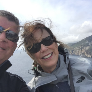
The Original reference for the painting was a photograph I took of the Oregon Coast.

The first step in a painting is always creating one or several value sketches. Here I did this with gray and black markers. I tried to emphasize the darkest darks against the lightest lights. Also, I did not allow any white against the borders of the painting. This is one of the design elements that I learned from Don Andrews.

The colors that Don Andrews suggest for this painting include:
Manganese blue
Joe's Blue (Phthalo blue)
Prussian blue
Permanent Magenta
Aureolin Yellow
Burnt Sienna
Scarlet Lake
The second step in the painting process was to wet the entire piece of watercolor paper and then drop in paint for the colors of the hills and shore in the background. Because this was the first wash, I was attempting to create middle value land masses.
I used Aureolin and Joe's Blue to create cool greens and then added Scarlet Lake to make earthier greens.
I made a gray using Manganese Blue and a little Scarlet Lake.
I also added a little Burnt Sienna and Violet to the cliffs to increase the variety of colors and the value.

The third step in the painting process was to re-wet the area of the page where the water was going to be painted. The wet paper allows for soft edges.
I was looking for different negative shapes when I applied the color.
I started with light green for the water and then added Manganese Blue to make stronger colors.
Additionally, I rewet the area of the paper for the sky and used a gray made from Manganese Blue and Scarlet Lake for a cool gray. I used Joe's Blue and Scarlet Lake for a warmer gray.
I didn't save any whites in the sky (because the focus, or center of interest, is the white of the water and the rocks) and I used wide brush strokes of varying grays.

The fourth step in the painting process was adding the far away land masses using various grays. You may notice in the painting below, that the colors of the rocks and water are lighter. This happens when watercolors dry. A quote from the famous watercolor artist Ed Whitney states, "If it looks right when it's wet, it's wrong".

The fifth step in the painting process was to let the water area dry completely and then strengthen the blue areas by using Manganese Blue with a touch of Scarlet Lake and a touch of Joe's Blue. I re-wet some of the water areas to create a soft edges. When this area was dry, I added Prussian Blue to create dark blue water.
I also darkened the rocks and added more color in the foreground.
I kept the areas of white inside the picture frame so that your eyes focuses on the areas of darkest dark against lightest light.

Final Painting! It was so fun to work on.


Comments